
Design a shop logo for your frontage and packaging
Give the full shop name a distinctive letter detail and test it on the fascia and packaging.
Write one sentence explaining why someone chooses your shop. A boutique known for carefully selected pieces will often want different lettering from a shop known for bold streetwear. Use that sentence to judge your choices.
Let the lettering express something about your shop
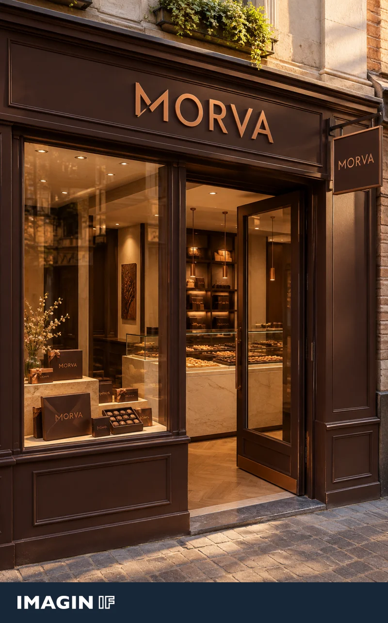
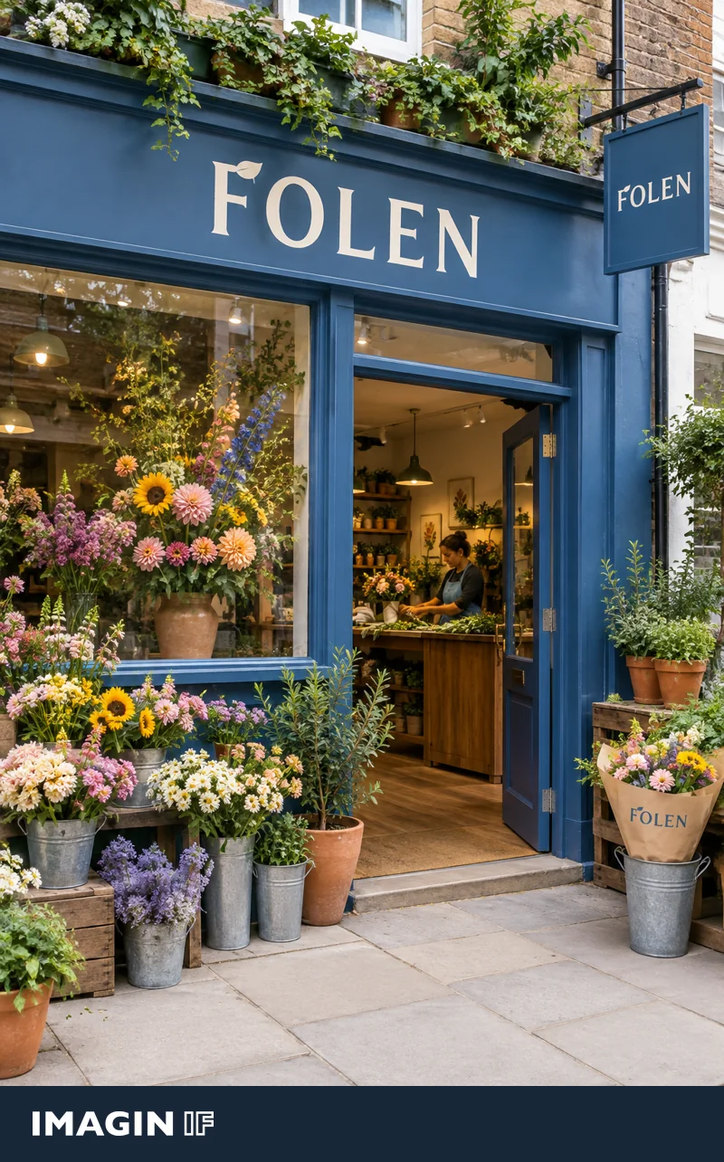
Describe the feeling you want the range to convey and choose one characteristic to express in the lettering. A chocolate shop can use the snap of a piece of chocolate. In the MORVA concept, it appears as a diagonal break in the M. In FOLEN, a leaf-like finish on the F reflects the florist’s work and carries through to the bouquet sleeve. Find a detail that makes sense for your own range and keep the rest of the name easy to read.
Test the frontage before you work on packaging
Set the full shop name in two or three lettering styles and try each on a photo taken from the real approach. Look at the space between characters, the width of the letters and the contrast with the background. A fine detail may close up when viewed from the street, even if it looks clear on a screen. Keep its recognisable shape and simplify it until the full name reads comfortably.
Start with the full shop name. Choose lettering people can read from the pavement and give it one distinctive detail. A fold in the V of an imaginary boutique’s name could suggest the way fabric drapes. Repeat that fold on the fascia, the bag and the garment label. Check the logo at street distance and at the smallest size you need to print.
See what survives on a smaller surface
Print the wordmark at the smallest size you expect to use, perhaps on a label, sticker or paper band around a gift box. Set a one-colour version and a picture of the fascia beside it. See whether you recognise the same shape on all three. If the detail disappears at small sizes, test it with fewer fine lines. Share the intended uses, contrasts and materials with your printer or sign maker so the distinctive letter survives on the surfaces where customers will see it.
Finish with a one-colour version. It will help you see which letter shapes and details hold up on simple print and against different backgrounds.
When should you keep an existing shop logo?
Look at what regulars already recognise. A familiar name with good letter shapes can become easier to read through extra spacing, a larger scale or a clearer background. Try improving the existing wordmark and compare it with a fresh option. Look at both on three surfaces you use every day, such as the frontage, packaging and receipts. If the familiar element still holds up, a focused adjustment may be enough to bring those uses together.