
Design a shop sign people can read from the pavement
Compare lettering, contrast and a projecting sign from the pavement, by day and after dark.
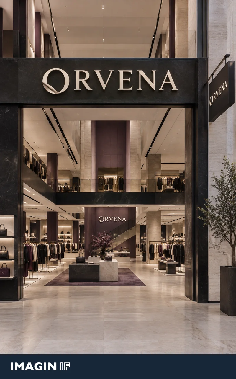
A sign above a doorway is easy to see from straight across the street. Someone approaching on the same pavement sees it at a much sharper angle. Photograph your shopfront from both directions to see where its name first becomes readable.
Decide where someone should be able to read the name
Approach from both directions and mark the point where you would ideally like a passer-by to see the shop name. Take a photo at eye level from each spot. A fascia can be clear on an open square, while a projecting sign may come into sight sooner on a narrow pavement. Check for awnings, trees and neighbouring signs. If they cut across the view, position matters as much as letter size.
Test your wordmark at full size and from an angle
Leave clear space around the full name. Heavier lettering can help when thin lines disappear. Check that the openings in the letters stay clear and that similar letters are easy to distinguish. The ORVENA concept places the shop name on both the fascia and the projecting sign. A folded overlap in the O ties the two together. Stand to the side when you test raised letters. Quiet or darker side faces can help the readable front edges stand out.
A projecting sign can bring the name into view sooner. Test the full name at the size you have in mind. Look at contrast, letter spacing and how it reads from an angle. With thick, raised letters, the sides can distort the letter shapes if they are the same colour as the face. Compare daylight and evening views as well. A lit sign can look bright up close while losing its detail at a distance.
Make a trial sign before ordering
Print a sample at the intended size or put up a paper trial in a suitable place where you have permission. Check it in full daylight and at dusk. With lit lettering, look for bright areas where the edges appear to merge. Compare the two clearest versions on the same photo. Record where you could first read the name, then share that view, the intended mounting position and the photos with your sign maker.
Place two versions on the same photo. Compare them from the point at which people need to recognise your shop.
Should the sign lead with the name or what the shop sells?
A name familiar to regulars can be enough for them. Someone who has never visited may need a short cue such as ‘flowers’ or ‘bespoke tailoring’ to understand the offer. Test that cue as a second line on the frontage or as part of the window. Keep the full shop name prominent on the projecting sign. Look at both lines from the same distance. If the extra wording is too small to read, give it a place closer to the door where people have time to stop and see it.